
Personalizzare il pannello di dettaglio del PivotViewer di Silverlight 5.0
Nell'articolo sul controllo PivotViewer
(https://www.silverlightitalia.com/articoli/silverlight/pivotviewer-v2-silverlight-5.0.aspx),
disponibile nell'SDK di Silverlight 5.0, abbiamo introdotto le possibilitŕ di personalizzazione del layout delle tradecards. Anche il pannello di dettaglio puň essere fortemente personalizzato.
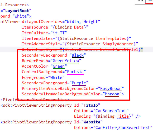
La scelta dei colori si puň gestire attraverso le proprietŕ:
- SecondaryBackground
- BorderBrush
- AccentColor
- ControlBackground
- Foreground
- SecondaryForeground
- PrimaryItemValueBackgroundColor
- SecondaryItemValueBackgroundColo
Con i seguenti valori:
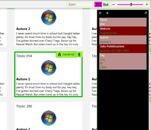
Si puň ottenere il risultato seguente:
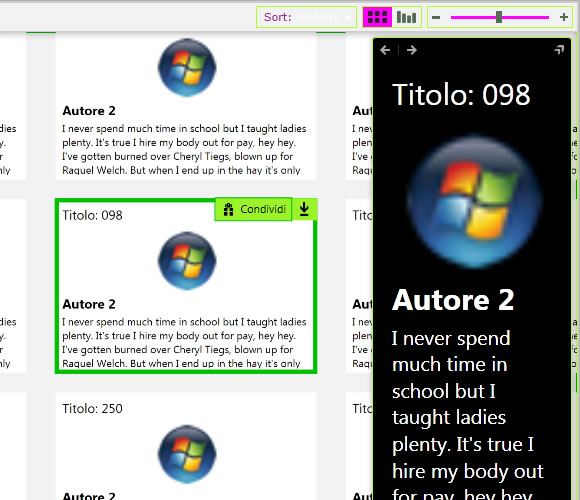
La barra, inoltre, puň essere anche completamente ridefinita: trattandosi del controllo PivotViewerDetailPane possiamo ridefinire il suo Style ed il suo Template.
Ecco un esempio:
<Style TargetType="sdk:PivotViewerDetailPane"
     x:Key="DetailPaneStyle1">
  <Setter Property="Foreground"
      Value="{Binding Foreground,
      RelativeSource={RelativeSource Mode=FindAncestor,
      AncestorType=sdk:PivotViewer}}" />
  <Setter Property="BorderBrush"
      Value="{Binding BorderBrush,
      RelativeSource={RelativeSource Mode=FindAncestor,
      AncestorType=sdk:PivotViewer}}" />
  <Setter Property="AccentColor"
      Value="{Binding AccentColor,
      RelativeSource={RelativeSource Mode=FindAncestor,
      AncestorType=sdk:PivotViewer}}" />
  <Setter Property="Background"
      Value="{Binding SecondaryBackground,
      RelativeSource={RelativeSource Mode=FindAncestor,
      AncestorType=sdk:PivotViewer}}" />
  <Setter Property="ControlBackground"
      Value="{Binding ControlBackground,
      RelativeSource={RelativeSource Mode=FindAncestor,
      AncestorType=sdk:PivotViewer}}" />
  <Setter Property="SecondaryForeground"
      Value="{Binding SecondaryForeground,
      RelativeSource={RelativeSource Mode=FindAncestor,
      AncestorType=sdk:PivotViewer}}" />
  <Setter Property="PrimaryItemValueBackgroundColor"
      Value="{Binding PrimaryItemValueBackgroundColor,
      RelativeSource={RelativeSource Mode=FindAncestor,
      AncestorType=sdk:PivotViewer}}" />
  <Setter Property="SecondaryItemValueBackgroundColor"
      Value="{Binding SecondaryItemValueBackgroundColor,
      RelativeSource={RelativeSource Mode=FindAncestor,
      AncestorType=sdk:PivotViewer}}" />

  <Setter Property="ContentTemplate">
    <Setter.Value>
      <DataTemplate>
        <Grid Width="190">
          <StackPanel Margin="10">
            <TextBlock Text="{Binding Title, StringFormat='Titolo: {0}'}"
                   FontSize="30"
                   Margin="5"
                   HorizontalAlignment="Left" />
            <Image Source="{Binding WebsiteLogo}"
                 Height="150"
                 Margin="5"
                 Stretch="Uniform" />
            <TextBlock Text="{Binding AuthorName}"
                   FontSize="30"
                   FontWeight="Bold"
                   Margin="5,0,5,0"
                   HorizontalAlignment="Left" />
            <TextBlock Text="{Binding Abstract}"
                   FontSize="20"
                   Margin="5"
                   TextWrapping="Wrap" />
          </StackPanel>
        </Grid>
      </DataTemplate>
    </Setter.Value>
  </Setter>
</Style>
Nello Style precedente possiamo vedere come le proprietŕ della barra vengano prese dai valori impostati sul controllo PivotViewer attraverso le espressioni di binding con RelativeSource e FindAncestor, novitŕ introdotta proprio in Silverlight 5.
Nel ContentTemplate, invece, abbiamo la possibilitŕ di definire tutto il markup per mostrare un layout completamente personalizzato.
Ovviamente, ridefinendo il ContentTemplate, ci perdiamo le molte funzionalitŕ implementate nativamente dal controllo, che se necessario devono essere reimplementate manualmente.
Commenti

Per inserire un commento, devi avere un account.
Fai il login e torna a questa pagina, oppure registrati alla nostra community.
Approfondimenti
Realizzare un accordion con gli elementi HTML details e summary
Evidenziare una porzione di testo in un pagina dopo una navigazione
Gestire gli errori nelle Promise JavaScript con try()
Ciclo di vita risorse con .NET Aspire
Configuratione e utilizzo .NET Aspire CLI
Effettuare la ricerca di testo nascosto in una pagina web con Javascript
Eseguire query in contemporanea con EF
Proteggere l'endpoint dell'agente A2A delle Logic App
Utilizzare il top layer in HTML
Utilizzare Intersect e Except per filtrare set di dati in TSql
Creare un agente A2Acon Azure Logic Apps
Rendere affidabile lo scale out su Azure App Service
I piů letti di oggi
- Gli agenti AI sono uno dei temi più interessanti del momento, ma costruirli bene richiede molto più di un semplice prompt. In questa sessione parleremo di Azure AI Foundry con un taglio concreto, utile per capire come progettare agenti AI enterprise-grade, integrarli con tool e memoria, monitorarli e gestirne il deployment in modo efficace. Ci vediamo a Milano al Global Azure 2026 - ASPItalia.com, con Stefano Demiliani. #GlobalAzure #Azure #AzureAIFoundry #AI #AIAgents https://aspit.co/globalazure-26
- AKS non significa solo fare deploy. Significa anche gestire workload, operation, scalabilità e affidabilità nel modo giusto. In questa sessione parleremo di Azure Kubernetes Service con un taglio concreto, utile per chi vuole capire come portare Kubernetes in produzione senza complessità inutile. Ci vediamo a Milano per il Global Azure 2026 - ASPItalia.com, con Antonio Lamorte e Matteo Tumiati. #GlobalAzure #Azure #AKS #Kubernetes https://aspit.co/globalazure-26
- Utilizzare zizmor per rendere più sicuri i workflow di GitHub


